
Senior exhibition

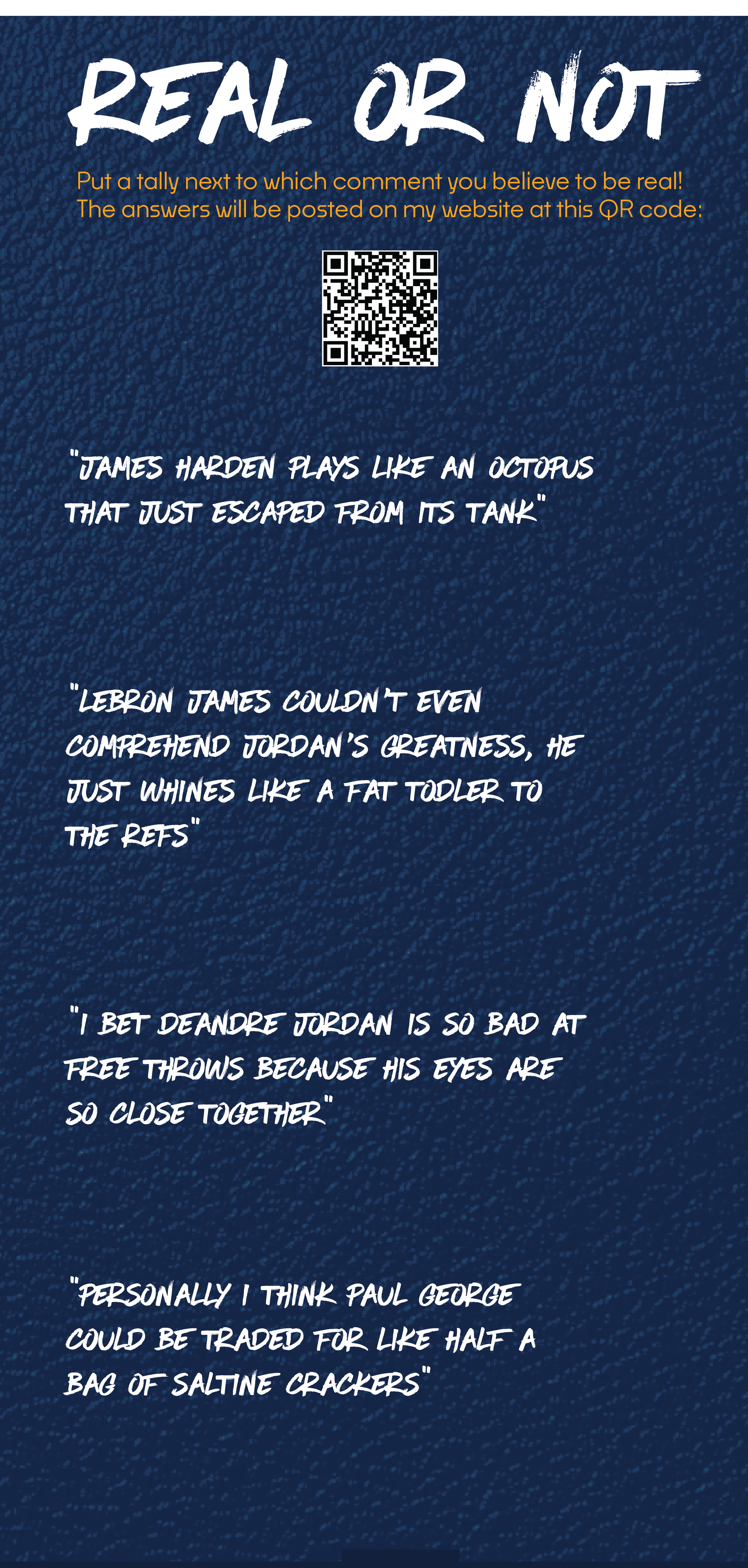
Real or Not
Objectives:
The Real or Not section was made as an interactive element that people could write on. I thought it would be a fun idea to see which comments got the most votes and if they were correct or not. The comments themselves were pulled from NBA mean tweet readings on YouTube and really show just how strange sports media can be. I wanted to keep this design super clean and easy to read so the texture was kept at a minimum and the splatter was removed.
Strategies:
The comments I chose were supposed to be insanely stupid and hilarious to show the weird stuff people will say when frustrated with sports. I intentionally wrote the two other comments in a similar manner to make each one seem equally stupid. This game was purely for fun and provided an activity to draw viewers in and feel like they made their mark


Objectives:
For this project it was our job to create a physical exhibition based off a thesis paper we wrote in the previous semester. My paper was about the detriment the rise of social media has had on athlete’s mental health and ways we could implement new systems to fight the crisis. For my exhibition, I wanted to keep that sporty feel while also conveying information in an effective manner. This was very challenging but proved to be a great finale to my time here at the U of M.
Strategies:
Font wise I wanted to find a font that conveyed that college like aesthetic that I got to see working for the Gopher football team. This led me to a graffiti like font that really had that dynamic motion and was pretty easy to read. Color wise I wanted a more neutral background with a great highlight color. The orange and white provided great basis for my text while also allowing me to highlight what I wanted. I also used a splatter overlay to continue that hectic sport vibe and pair with the paint like font. I think they all turned out great and the vision truly came to life.

Pure Stats
Objectives:
The pure stats panel was all about numbers. I wanted to give people easy to understand facts that demonstrated the unique relationship that sports media and mental health had. Providing perspective into this situation was my number one priority when it came to designing the collateral and conveying that information was difficult. I think here I achieved that by using color to again highlight the numbers and imagery people should look at first.
Strategies:
Using color to highlight the important information was my main strategy and I also changed the font based on the hierarchy as well. Each “stat” demonstrates the relationship between social media and mental health and just how common it has become to utilize it for NIL dealings and networking. Using Caitlin Clark as a hero image was also on purpose as I believe she encapsulates the strength needed to be successful in todays sports world.
Design
time Tells
Objectives:
The timeline was the most important piece of the exhibition. It showed in detail the explosion of social media and how as time moved on the amount of mental health crises in sports increased dramatically. The hardest part was finding a way to convey all the information so eventually we decided it would be best to have sections to group the information in an effective way.
Strategies:
Using the normal color scheme I wanted to create a sport tone while also conveying the information effectively. The font could be a little more bold but I think the overall design will get people to come closer and take a glance. The images are all greyscale again to not allow any image to really take away from another and I think this piece turned out great.
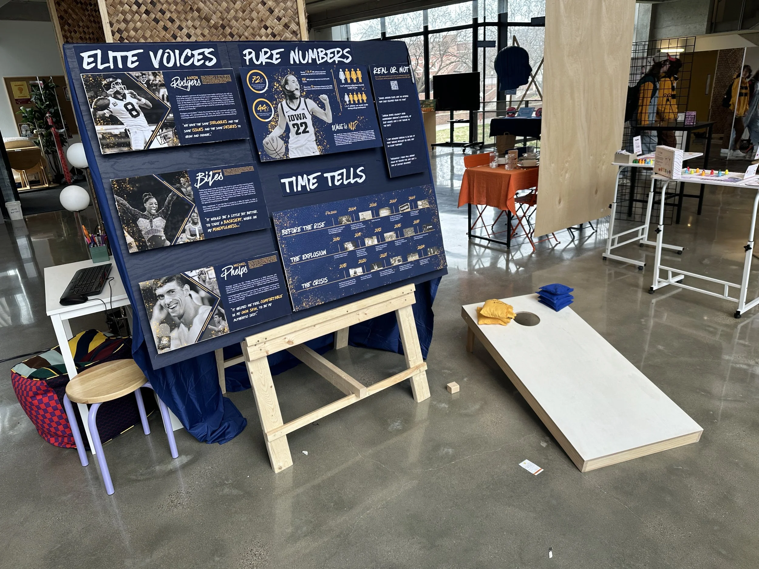
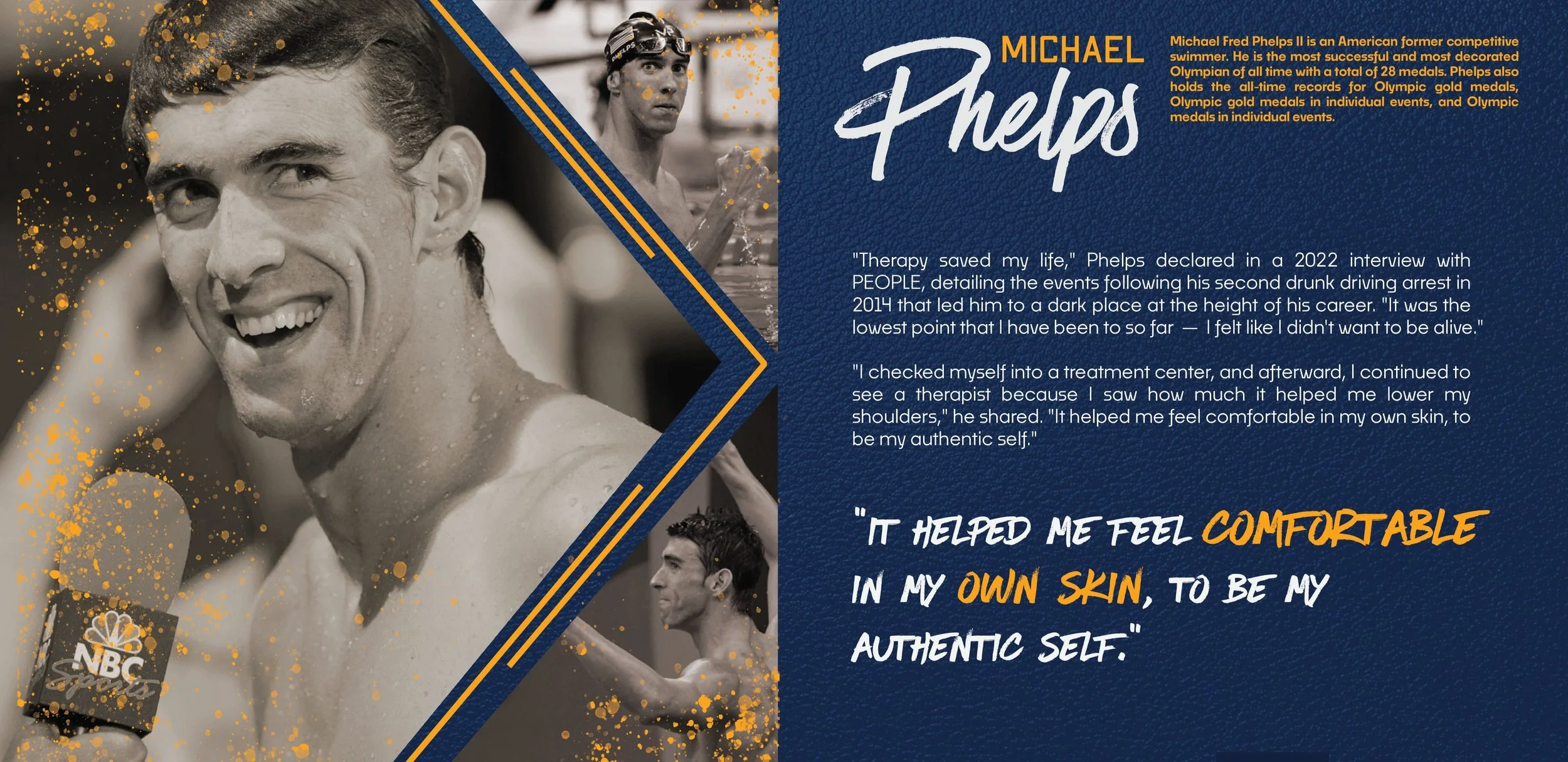
Elite Voices
Objectives:
The elite voices section provides a perspective on how some of the most famous athletes think about mental health. I wanted to include this because seeing people you recognize in an exhibit will immediately draw them in. I chose them specifically based on their history with mental wellness; Michael Phelps in now a huge advocate for men’s mental health, Simone Biles had to leave the olympics and has been super transparent about her struggles, Aaron Rodgers has always had a unique opinion on the media and he provides great insights into this landscape. They all provided an extra credibility boost to my exhibition while providing unique stories that most people will know.
Strategies:
These choices influenced the way I wanted to design these panels greatly. Since my main goal is to help people realize that these athletes are still human beings, I wanted to make each photo greyscale to make them all seem unified. I did add a tint of orange to match the other colors present on the panel and a great splatter effect to go with the font/color choices. The pull quote with a highlight of orange was the main focus of the panel and meant to give people a perspective of what they’ll be reading about. I know people don’t like huge paragraphs so I provided a short one to show the main quote and if they